This is an old revision of the document!
Table of Contents
Segmentation and Analysis Options
Before you can view aggregated analyses you must define the segments and/or worksheets to be analysed.
Creating segmentation criteria
To display aggregated output, you define the worksheets to be included, either by using the defined segmentation criteria or selecting the worksheets to be included ( all worksheets is an option). To create a new aggregation, click on the new button in the toolbar to display the following dialog.
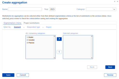 Selecting using the Segmentation criteria, allows you to select the categories you wish to select for each set of segmentation criteria and can combine options from the different sets of criteria (i.e. you could select dealers in a particular region or dealers and installers in several regions).
At each stage of the process clicking the Review button will show the current selection criteria. Click Save to generate the aggregated output and show the results.
Analysis outputs
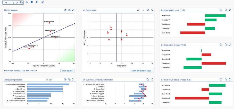
Once you have created your first aggregation the main analysis screen will be shown with the main charts as below:
The Value Map
The Value Map shows the value proposition of all players in a market, comparing relative perceived price and relative perceived quality of the players.
 * The Fair Value Line indicates the price versus quality sensitivity of the market.
* Customer Value is the perpendicular distance to the fair value line. Competitors below and to the right are offering above average value, those above the line are offering poor value for money.
* Market Differentiation is a measure of the spread of attribute scores and is defined as the average absolute difference in attribute scores between all competitors. A value below 1 indicates a relatively undifferentiated market and you would expect price to be more important than quality.
* The Fair Value Line indicates the price versus quality sensitivity of the market.
* Customer Value is the perpendicular distance to the fair value line. Competitors below and to the right are offering above average value, those above the line are offering poor value for money.
* Market Differentiation is a measure of the spread of attribute scores and is defined as the average absolute difference in attribute scores between all competitors. A value below 1 indicates a relatively undifferentiated market and you would expect price to be more important than quality.
The Attribute Chart
The Attribute Chart shows the importance of the purchase criteria in the horizontal axis and this business’ performance relative to its competitors in the vertical axis (i.e. average rating difference).

- The vertical blue line shows the average importance of all attributes with the most important being to the right.
- Attributes where the rating difference is below zero are ones where you have a competitive disadvantage, those above the line are where you have an advantage.
- As well as comparing yourself to All competitors you should also compare yourself to your closest competitor and/or the best performing competitor.
Attribute importance and performance
These charts are taken together to give another view of attribute performance.
Both show the attributes ranked in order of importance with the most important being first.
The attribute importance chart shows the weight of each attribute as a horizontal bar.
The attribute performance chart shows the range of score of each attribute as a blue bar and our score as the connected red dots.
In the example below, we can see that the spread of scores on the most important attributes is with 1 point with a much greater spread on the less important attributes. Our position is usually in a good position although we should be looking at improving attributes 1 and 6.

Quality, Price and Value
These charts show the elements of the Value map as individual bar charts.

- The relative quality chart show positive (above average) quality in green and competitors with below average in green.
- The relative price chart is flipped, with above average relative prices shown in red and below average prices in green.
- The relative value chart shows the combination of price and quality. Thus, competitor A has above average quality but below average relative price leading to poor value, whereas Competitor B has the opposite, poor quality and below average price giving a good value position.
Next: Interpreting the Results