This is an old revision of the document!
Table of Contents
Segmentation and Analysis Options
Before you can view aggregated analyses you must define the segments and/or worksheets to be analysed.
Creating segmentation criteria
To display aggregated output, you define the worksheets to be included, either by using the defined segmentation criteria or selecting the worksheets to be included ( all worksheets is an option). To create a new aggregation, click on the new button in the toolbar to display the following dialog.
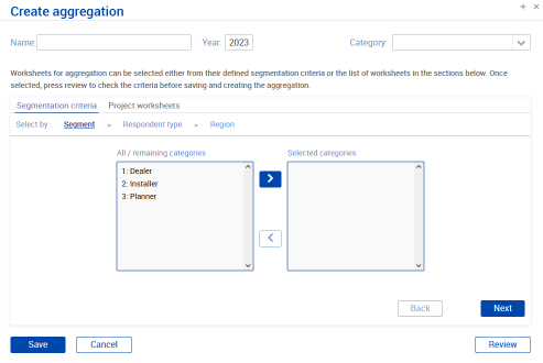 Selecting using the Segmentation criteria, allows you to select the categories you wish to select for each set of segmentation criteria and can combine options from the different sets of criteria (i.e. you could select dealers in a particular region or dealers and installers in several regions).
At each stage of the process clicking the Review button will show the current selection criteria. Click Save to generate the aggregated output and show the results.
Analysis outputs
Once you have created your first aggregation the main analysis screen will be shown with the main charts as below:
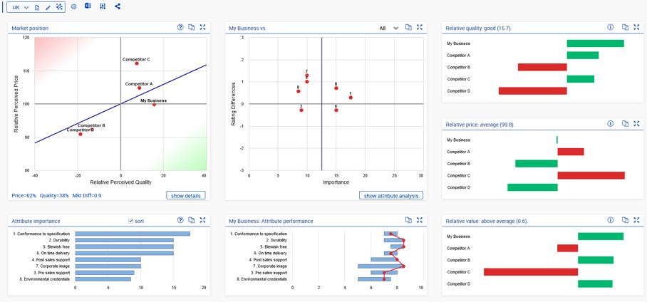
The Value Map
The Value Map shows the value proposition of all players in a market, comparing relative perceived price and relative perceived quality of the players.
 * The Fair Value Line indicates the price versus quality sensitivity of the market.
* Customer Value is the perpendicular distance to the fair value line. Competitors below and to the right are offering above average value, those above the line are offering poor value for money.
* Market Differentiation is a measure of the spread of attribute scores and is defined as the average absolute difference in attribute scores between all competitors. A value below 1 indicates a relatively undifferentiated market and you would expect price to be more important than quality.
* The Fair Value Line indicates the price versus quality sensitivity of the market.
* Customer Value is the perpendicular distance to the fair value line. Competitors below and to the right are offering above average value, those above the line are offering poor value for money.
* Market Differentiation is a measure of the spread of attribute scores and is defined as the average absolute difference in attribute scores between all competitors. A value below 1 indicates a relatively undifferentiated market and you would expect price to be more important than quality.
The Attribute Chart
The Attribute Chart shows the importance of the purchase criteria in the horizontal axis and this business’ performance relative to its competitors in the vertical axis (i.e. average rating difference).

- The vertical blue line shows the average importance of all attributes with the most important being to the right.
- Attributes where the rating difference is below zero are ones where you have a competitive disadvantage, those above the line are where you have an advantage.
- As well as comparing yourself to All competitors you should also compare yourself to your closest competitor and/or the best performing competitor.
Attribute importance and performance
These charts are taken together to give another view of attribute performance.
Both show the attributes ranked in order of importance with the most important being first.
The attribute importance chart shows the weight of each attribute as a horizontal bar.
The attribute performance chart shows the range of score of each attribute as a blue bar and our score as the connected red dots.
In the example below, we can see that the spread of scores on the most important attributes is with 1 point with a much greater spread on the less important attributes. Our position is usually in a good position although we should be looking at improving attributes 1 and 6.

Quality, Price and Value
These charts show the elements of the Value map as individual bar charts.

- The relative quality chart show positive (above average) quality in green and competitors with below average in green.
- The relative price chart is flipped, with above average relative prices shown in red and below average prices in green.
- The relative value chart shows the combination of price and quality. Thus, competitor A has above average quality but below average relative price leading to poor value, whereas Competitor B has the opposite, poor quality and below average price giving a good value position.
The Analysis toolbar
 The analysis toolbar has three sections as shown above. Depending on whether aggregations have been defined and if they have been grouped into categories, different elements may be hidden.
 The first section is only shown if you have created at least 1 analysis and assigned categories. The
  button allows you to create category definitions and is visible once you have defined an aggregation. If you have different types of aggregations (Regions, type of customers, etc.) it is useful to group them under different categories using this option.
 The second section lists aggregations. If a category is selected only the aggregations in that category are shown.
The
The second section lists aggregations. If a category is selected only the aggregations in that category are shown.
The  button creates a new aggregation,
  edits the current aggregation definition and clicking
  shows the completeness statistics for the survey.
 The options toolbar has the following buttons:
  allows you to modify the chart axes; pressing
  shows the results of any additional questions;
  output results to an Excel workbook;
  allows you to perform limited scenario and sensitivity analysis; and
  compares the current aggregation with another.
Categorising aggregations
If you create several different types of aggregation, it can be convenient to categorise them by type of aggregation. After you have created 2 or more aggregations the hierarchy icon will be shown to the left of the toolbar as shown below:
 Clicking
  launches the dialog below:
 Enter the names of the categories you wish to create, and press save.
The toolbar will now have an additional section for the categories as below, with all existing aggregations assigned to a category called “other”.
Enter the names of the categories you wish to create, and press save.
The toolbar will now have an additional section for the categories as below, with all existing aggregations assigned to a category called “other”.
 Use the pencil icon next to the aggrgation name to edit an aggregation and assign to the appropriate category.
Comparing segments
Once you have more than one aggregation segment defined you can compare them by clicking on the button.
Select the segment for comparison and the value positions and attribute analyses can be compared as below.

Scenario analysis
Clicking on the button launches the scenario analysis module. This allows you to investigate the effects prices changes, attribute scores and the effect the slope of the fair value line on the value propositions of the competitors.
The first screen, below, allows you to change the slope of the fair value line, and also, by clicking on the competitor name increase or decrease prices by a given percentage.

Similarly, clicking on one of the attributes allows you to change the score for a competitor on that attribute. However, when changing scores (especially for your business) you must have a business reason why that score could change. For example, creating a new distribution hub could boots on time delivery. In addition to the changes in values, there are also options to show the changes in value positions and also to fit a line through the points. This latter option is useful if the competitors appear to line up in a different orientation to that suggested by the price/ quality trade off.

When making changes to the relative prices and attribute scores it is important to note that the change might not be as big as you expect. Where prices are concerned, because they are relative, changing one competitor’s relative price will change the relative price of the others in the opposite direction, but by a smaller amount. When you suggest a change in attribute score, we change the score for that competitor by that amount on each worksheet (unless it would exceed 10 or be less than 1) and then recalculate the summary, which again could mean that the effect is less than expected. Shown below are the two change dialogs.

Next: Interpreting the Results